Stone and Fire
Related To:
June 1, 2016
3 min read
LOCATION:
Overland Park, Kan.
DESIGN TEAM:
Verner Johnson
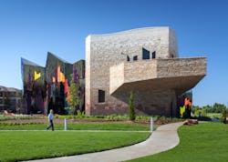
CHALLENGE:Located in Overland Park, Kan., the Museum at Prairiefire is more than a building—it is a work of art that rises from the prairie to tell a story of geology, culture and the practice of prairie landscape management through intentional burns. The standout architectural marvel, with a stone-clad backdrop that represents the undulating hillside, is alive with fiery sparks of color, which seem to flicker based on the time of day and the viewing angle.
According to Jonathan Kharfen, AIA and LEED senior associate, Verner Johnson, “At dusk, strategically placed LED lights twinkle along the low red site walls like dying embers as evening sets in.” The fire element is represented by a unique film material and the stones range from a myriad of colors as you move about the ultra-modern structure. Finding appropriate materials to evoke the flames, burnt landscape and charred remnants was a challenge.
INFLUENCE:The museum serves as a celebration of what the prairie represents and the rebirth and regrowth that comes out of the prairie fires.
The first spark of design for the museum came to Kharfen when he was working on the Flint Hills Discovery Center in Manhattan, Kan. Traveling to Manhattan, he witnessed the intentional burning of the ground to maintain the grasses. “That was the impetus for the overall design concept for the Museum at Prairiefire,” he said. “It’s part of the human-influenced ecosystem to burn the grasses in straight lines to give rise to new vegetation.”
SOLUTION:Limited by the colors of the Kansas natural stone’s gray, gold and light beige tones, Kharfen went with the manufactured veneer for the darker spectrum to achieve the desired gradient effect. “We incorporated four standard Cordova veneer colors and then worked closely with Oldcastle to create two custom colors,” said Kharfen.
With the gradient going from a dark gray to almost white at the top meant that one color course had to blend into another to get the desired effect. “The Charcoal colors of Cordova stone evoke the charred landscapes that give rise to lighter stone colors up Photos Courtesy: Sam Fentress Veneer to the top of the building,” he said. But, another consideration made manufactured stone a must have—the bottom “charred” area needed to be partially buried, so moisture resistant materials designed to be installed below grade were essential. Also, the landscaped berms around the stone portions of the building meant that, in certain areas, several feet of the façade would be below grade.
To graduate from charcoal to grayish-gold on the exterior wall, Kharfen wanted a brownish-red stone veneer to match the natural red sandstone used on the interior, and for the low site walls, a custom red with orange highlights.
nullOverland Park, Kan.
DESIGN TEAM:
Verner Johnson
About the Author
John Mesenbrink
Senior Editor
Sign up for our eNewsletters
Get the latest news and updates
