2026 Color Trends: Embracing Neutrals and Earth Tones for Calm and Sophistication
Key Highlights
- Neutral colors are gaining popularity for their ability to add depth and anchor spaces, moving away from previous vibrant trends.
- Pantone's Cloud Dancer symbolizes society's craving for calm, offering a soothing alternative to the chaos of modern life.
- Dark grey hues like Benjamin Moore's Silhouette embody sophistication and versatility, blending classic silhouettes with contemporary design.
- Smoky jade challenges convention while maintaining a grounded, natural feel.
- Colors like Universal Khaki and Warm Eucalyptus emphasize versatility and serenity, aligning with biophilic and restorative design trends.
It's the time of year when designers and trend experts sift through the cultural currents to distill the spirit of the moment into a few time-defining hues. Veering from the energetic, vibrant, more daring shades of years past, most paint manufacturers submitted neutral colors for 2026, but as you'll see neutral is the new inspiring.
"Neutrals can get a bad rep for being boring, but I think that they have so much potential to anchor a space and to create depth," said Houston Interior Designer Marie Flanigan.
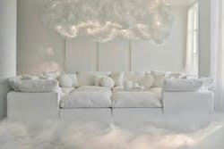
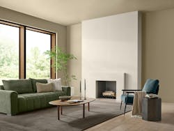
Cloud Dancer from Pantone
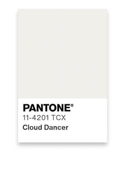
Pantone selected this billowy white hue as its Color of the Year 2026, giving a nod to society's current craving for solace, calm, and tranquility in this fast-paced, technology-saturated world.
"The cacophony that surrounds us has become overwhelming, making it harder to hear the voices of our inner selves. A conscious statement of simplification, Cloud Dancer enhances our focus, providing release from the distraction of external influences," states Executive Director of the Pantone Color Institute Leatrice Eiseman.
Silhouette from Benjamin Moore
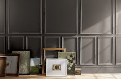
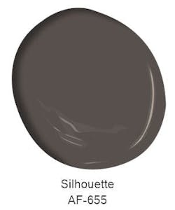
This dark grey Color of the Year from Benjamin Moore is a sophisticated and versatile neutral that balances refinement and distinction, while delivering authenticity and staying power.
"The connection between fashion and interiors has always been a source of inspiration but this year in particular, we've noticed a renewed interest in suiting and classic silhouettes; the resurgence of timeless pieces; and the growing interest in the brown color family," said Andrea Magno, direction, color marketing and design at Benjamin Moore. "Silhouette embodies these qualities with its depth and luxurious blend of burnt umber and delicate charcoal undertones. Like a perfectly tailored suit, this hue has the versatility and softness to bring a space from expected to exceptional."
Hidden Gem from Behr
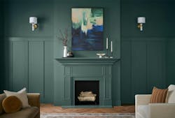
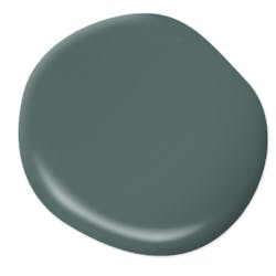
Behr's 2026 Color of the Year is Hidden Gem, a smoky jade tone that works as both a soft neutral and a bold accent. This pick stays within the conservative neutral range, but ventures out towards a green and blue blend to introduce more color.
"Now, more than ever, there's a growing appetite for colors that challenge convention and bring an unexpected sense of wonder to everyday spaces," said Erika Woelfel, VP of Color and Creative Services, Behr Paint. "Hidden Gem captures that spirit in both name and color—its depth and refinement meets the desire for colors that are eternally stunning and stylish."
Hazelnut Crunch from Clark+Kensington
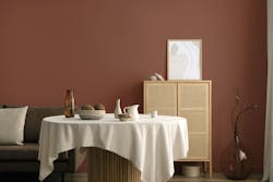
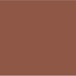
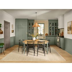
This warm, reddish brown shade was selected as Color of the Year by Clark+Kensington. It offers a neutral alternative to greys and beiges and still supports biophilic design trends. Reminiscent of various items found in nature, this color pairs well with lush greenery and looks wonderful in natural light, providing the connection to nature and warm-toned interior that architects and owners are seeking.
Universal Khaki from Sherwin-Williams
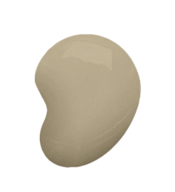
This year Sherwin-Williams chose Universal Khaki as its Color of the Year. Described as an easygoing, earthy hue that helps pull a room together, Universal Khaki echoes the versatility of the uniforms and canvas material it often describes. This combination of beige and light brown works well with natural finishes, whites, and pops of color.
"Khaki by design is kind of meant to blend into its surroundings and not to make a statement, which perhaps was a statement within itself," said Houston Interior Designer Ben Johnston. "Khaki's cousins beige and taupe have been very popular for the last decade, so I think it's about time that khaki joined the party."
Warm Eucalyptus from Valspar
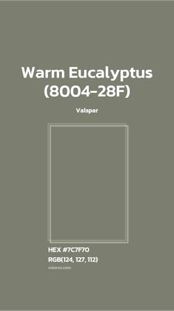
Valspar's Color of the Year is Warm Eucalyptus, a grounding green that brings a sense of ease to an interior. This hue evokes naturally restorative and serene feelings that are desired in both residential and commercial projects.
"Warm Eucalyptus is more than just a beautiful shade of green, it's a reflection of the comfort we crave in our homes," said Sue Kim, director of color marketing at Valspar. "Its warm undertones create a grounded, welcoming mood while drawing inspiration from nature and the familiarity of retro design. It is a color that encourages restoration and resilience."